
Design Your Future
While on my semester abroad in Düsseldorf, I found that there was a majority of women studying design but a lack of women in leadership roles in the creative industry; the exact same as Scotland.
I wanted to highlight the women that where in these roles to try encourage and inspire more young female designers to consider higher positions as well as raising awareness of how males can help raise the profile of diversity in the industry.
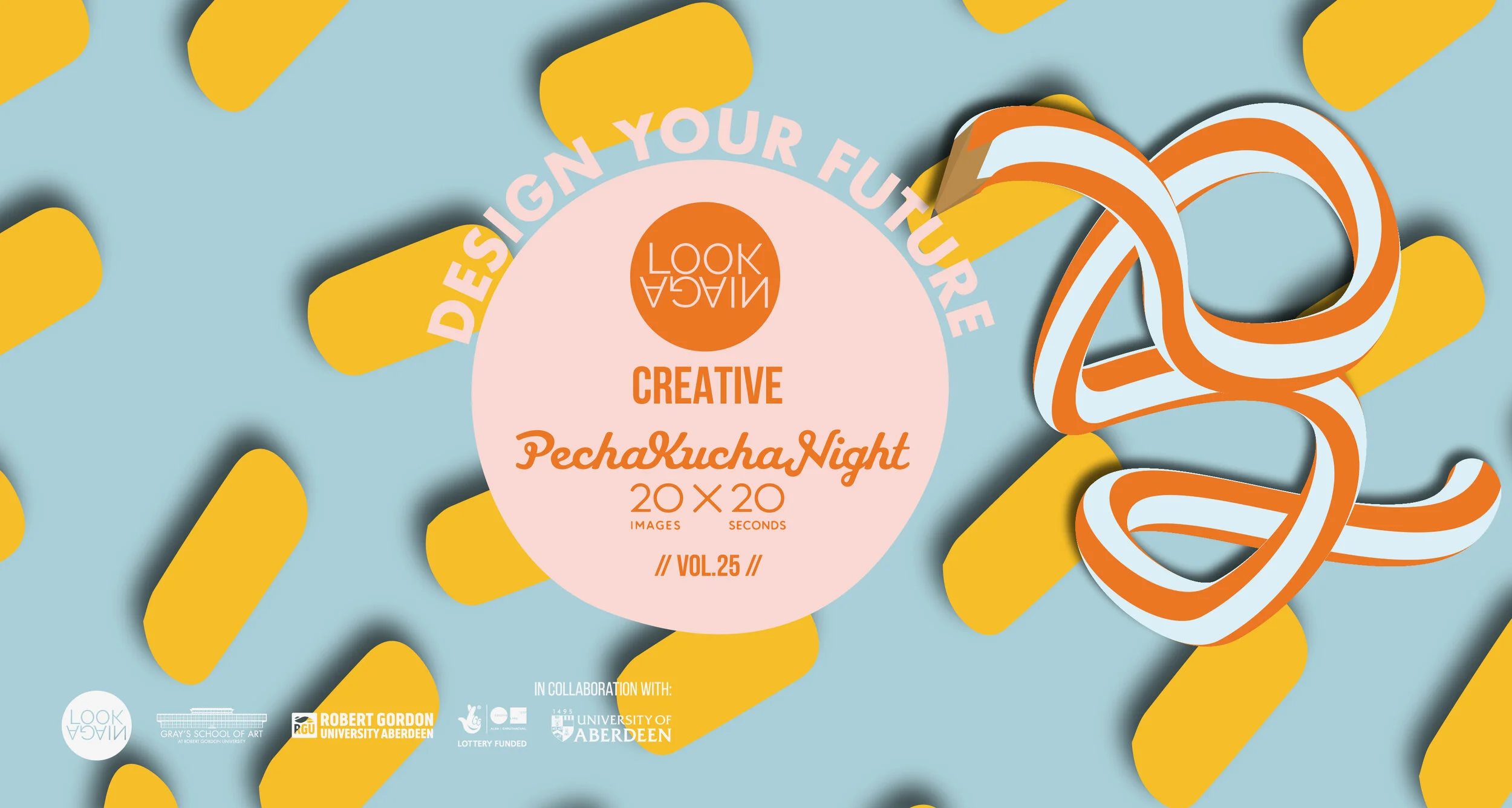
Design Your Future;
Scottish Edition
This event was in partnership with The University of Aberdeen, Gray’s School of Art, Belmont Film House and Aberdeen City Council.
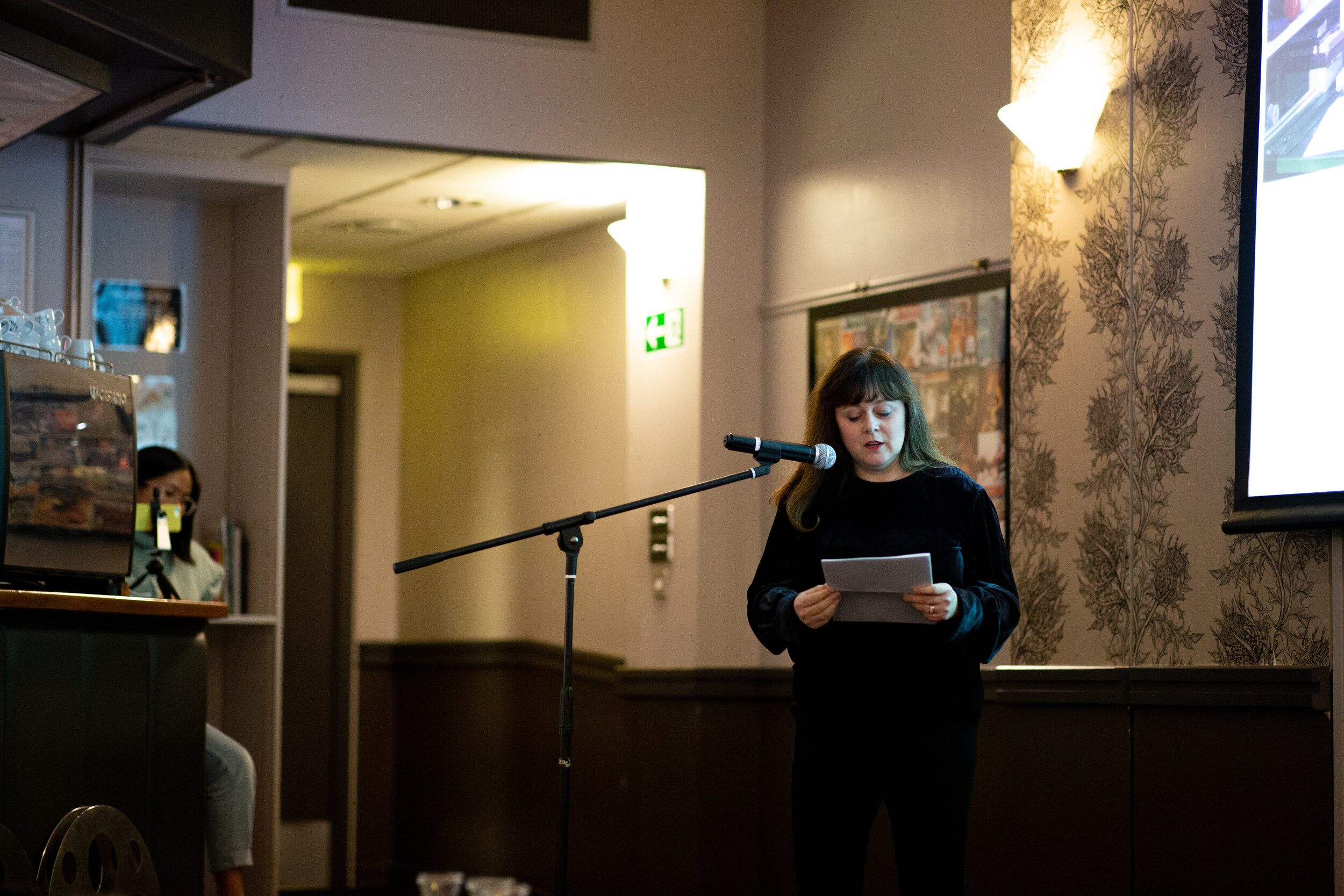
Event curated by Meghan Doran in collaboration with Look Again Aberdeen highlighting Scottish women in the creative industries.
Photography by Sean Steen
Video by Sean Steen
After the success of the event in Düsseldorf, I moved back to Scotland with a desire to continue to curate events and raise awareness of the incredible female creatives I saw.
This time, I decided to partner up with Look Again Aberdeen for their advice and expertise in event curating to curate my next Design Your Future; Scottish edition!


Design Concept
Due to working with Look Again, I had to consider their branding as well as putting my own twist to the design since I was curating the event.
I ended up coming up with this design, using Look Again’s illustrative elements; expanding them and making them 3D and adding this huge twisted pencil. The twists are supposed to represent the journey’s of the creative speakers experience in the creative industry.
The pencil also represents learning while making a subtle connection to the first Design Your Future I curated back in Germany.


Where it all began…
Designing Your Future; Deutsch Edition


Design Concept
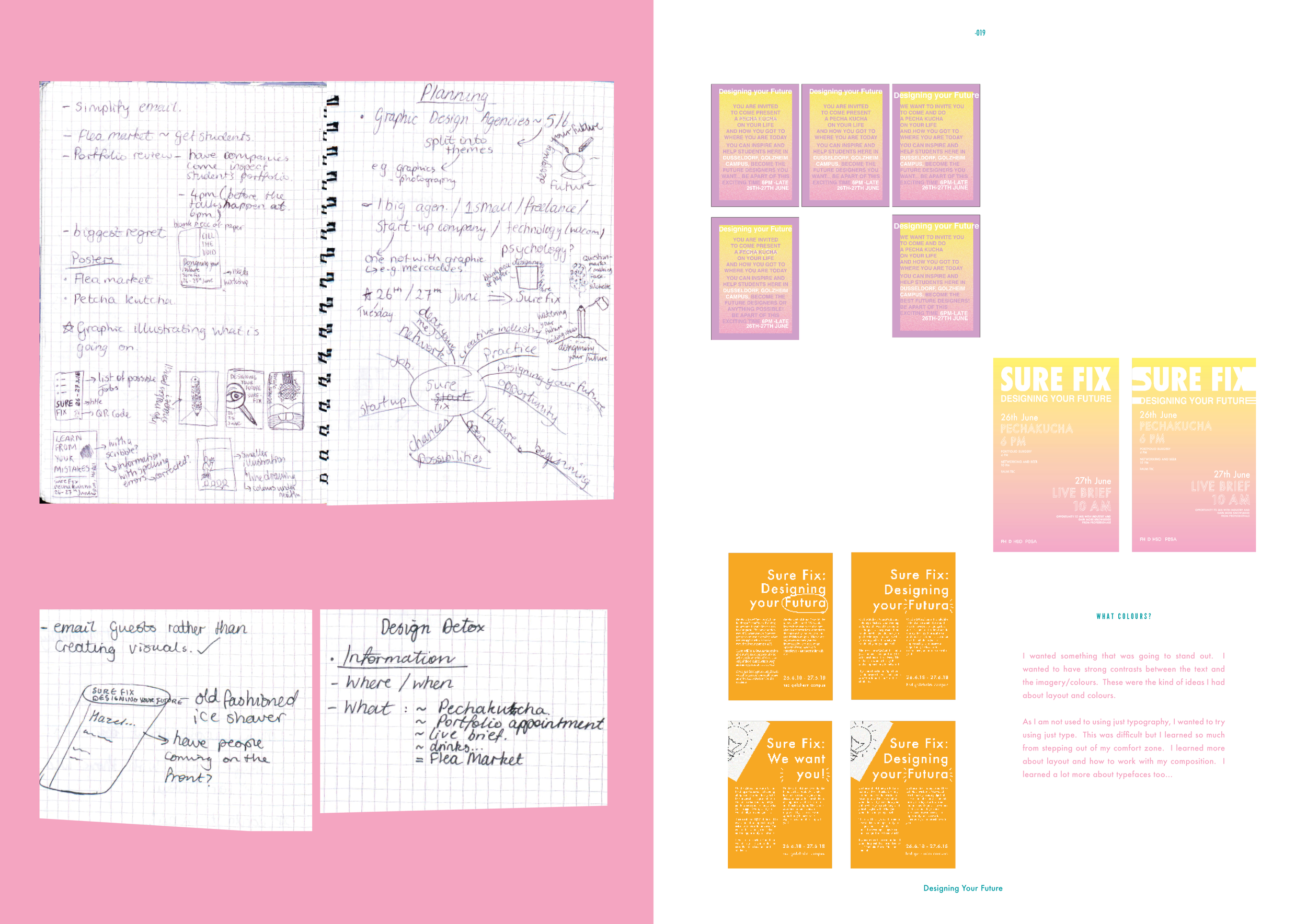
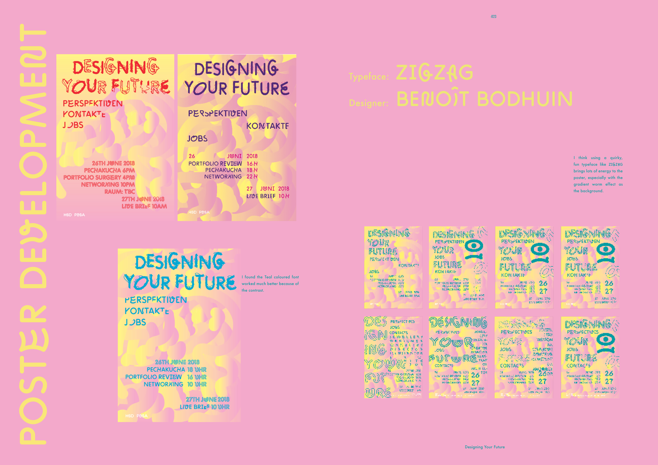
I wanted to go quite experimental with this poster to push myself creatively while also making a poster which was eye catching and unique.
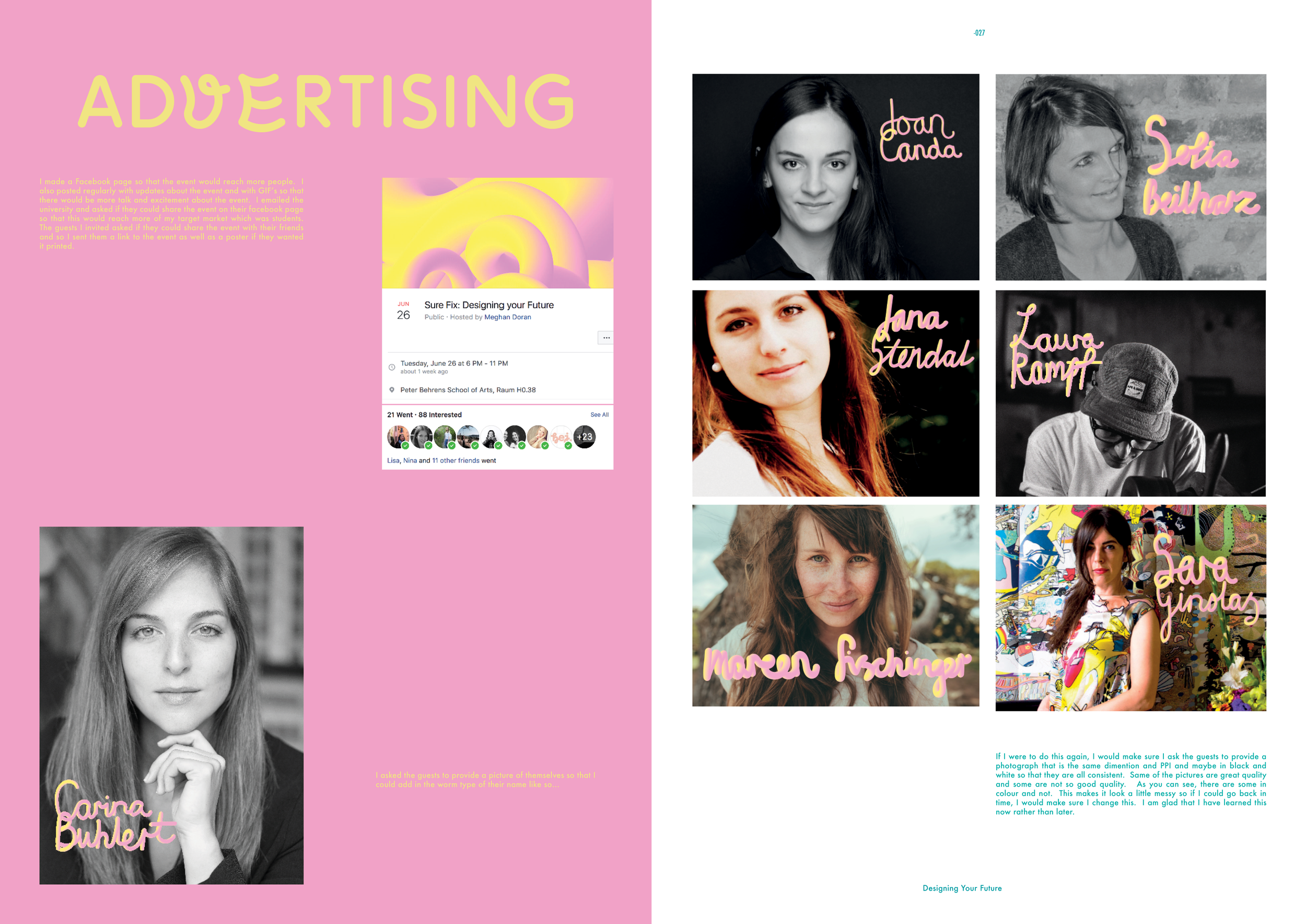
The worm effect represents the journey of the creatives that I had presenting their work and experiences in the industry. The colours are very contrasting to highlight the divide in the creative industry considering gender in director positions. I decided to use the typeface Zig Zag because of the fun, unique nature of each letter to illustrate the benefits of having a move diverse industry bringing new perspectives and ideas to projects and to ourselves.
The overlapping of the shapes and letters highlight the competitive nature of the industry, that everyone is just trying their best but we should continue to strive to help and lift one another.


What People Have Said About Design Your Future Events
“ The creative insight from the speakers and how relaxed the atmosphere was - I felt very comfortable approaching speakers and chatting with them about design and careers.”
“[I enjoyed the] Shout outs at the end. Good range of creatives as well giving presentations.”
“It made me feel a bit better about myself hearing that successful designers struggled at first but made it in the end.”
“Lots of different speakers! Was super interesting hearing from people from different backgrounds. Super well organised!”
Designing the future of DYF…
I would love to continue doing DYF and in other countries and continue to encourage and inspire young female designers that it is perfectly normal to struggle and it’s even better if you contact people in the creative industry and ask for help.
If you would like to collaborate, get in touch! I would be delighted to chat to you about how we can go about doing it.